
 Entradas
3D Meninas explained
17 de Diciembre del 2009A lot of people is asking me how my Pure CSS 3D Meninas effect works and how I did it. In this post I will try to fully explain it, from the image edition part to the html/css coding part. Even if this is going to look like a tutorial, please, don’t take it as a tutorial; this effect is just an experiment and not thought to be useful or a good practice in web design.
Bastantes personas me han pedido que explique cómo hice y cómo funciona mi efecto 3D de las Meninas con CSS. En este post voy a intentar explicarlo al completo, empezando por la edición de imágenes y terminando con la parte de código html y css. Por favor, no toméis esto como un tutorial; va a parecerlo, pero el efecto es sólo un experimento y no está pensado para que sea útil ni una buena práctica de diseño web.
Finding the vanishing point / Encontrando el punto de fuga
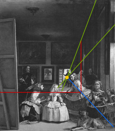
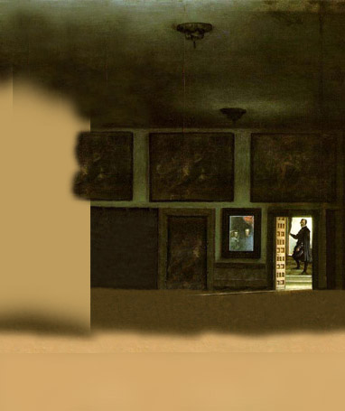
Trace 2 lines (in green) following the 3d parallel lines in the right wall until they cross. The crossing point (in yellow) is the vanishing point. Trace two lines following the right and bottom corners of the back wall (in red). A line crossing the vanishing point and the intersection of the two red lines (in blue) defines the corner of the ground with the right wall.
Traza dos líneas (en verde) siguiendo las paralelas en 3d de la pared de la derecha hasta que se crucen. El punto de cruce (en amarillo) es el punto de fuga. Traza dos líneas siguiendo las esquinas inferior y derecha de la pared del fondo (en rojo). Una línea que pasa por el punto de fuga y la intersección entre las líneas en rojo (en azul) define la esquina que forma el suelo con la pared derecha.
Layers’ movement speed / Velocidad de movimiento de las capas
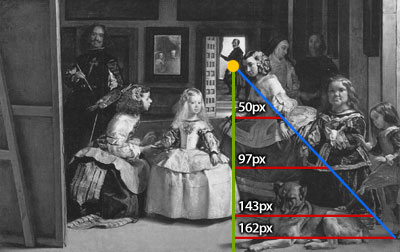
When moving the layers to make the parallax effect by displacing the vanishing point as in my effect, the relative speed of these is inversely proportional to the height from the vanishing point to the ground. The red horizontal lines are proportional in width to this height too (Intercept theorem), and I believe it is easier to see it this way. If you want to move the viewer instead the vanishing point, the speed would be directly proportional instead of inversely.
Al mover las capas para crear el efecto 3d parallax, la velocidad de cada capa ha de ser inversamente proporcional a su distancia vertical desde el punto de fuga al suelo. En la imagen, las líneas rojas horizontales son proporcionales en largo a esta distancia (primer teorema de Tales), y creo que así se entiende bastante mejor. Si en vez de mover el punto de fuga, moviésemos al espectador, la velocidad de las capas sería proporcional en vez de inversamente proporcional.
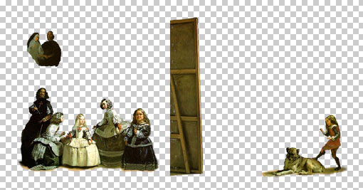
Cutting the images / Recortando las capas
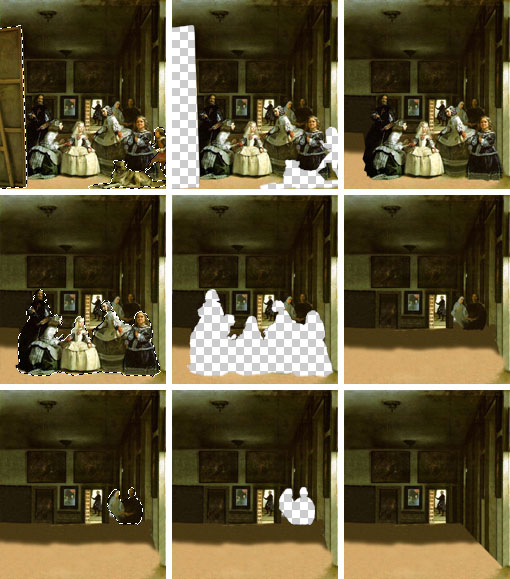
This is the part that takes more time: cut a layer and place it apart, fill the holes, cut another layer, and so on. Obviously it is not required to paint parts of the image that are going to be occluded in the effect.
Esta es la parte en la que se tarda más: corta una capa y déjala aparte, rellena los huecos, corta otra capa y así. Obviamente no es necesario pintar las partes de la imagen que van a quedarse ocultas en el efecto.
CSS Sprites / Sprites CSS
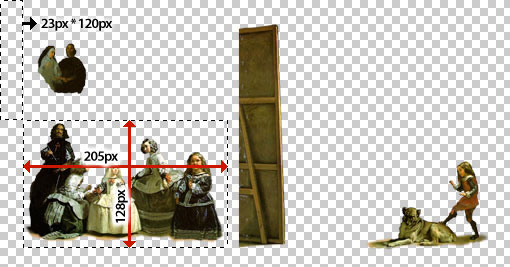
In this example I’ve used the CSS sprites technique, wich consists in making a big image containing different images, and then show these cutted by CSS. By reducing the number of files a website have to request to the server, the loading time get decreased. The layers look like this:
En este ejemplo he usado la ténica de sprites CSS.
So, how to make a CSS Sprite? Use a block element with the sprites file as background-image, with the width and height of the sprite you want to take, and background-position defining the offset of it in the whole sprites image. Remember that the background positions should be negative.
¿Cómo hacer un sprite CSS? Usa un element block al que le asignas de background-image el fichero de sprites, con el ancho y alto del sprite que quieras tomar y de backgrond-position la distancia hasta la esquina superior izquierda de la imagen de sprites completa. Recuerda que las posiciones del fondo deben ser negativas.
<div style=”background-image: url(’meninas-sprites.png’); width: 205px; height: 128px; background-position: -23px -120px”></div>
Complex hover effects / Efectos complejos de hover
Current browsers support complex hover effects for all tags and allow changes in child tags caused by the hover of the parent tag. Let’s take a look of the following code:
HTML:
<a href=”#” mce_href=”#”><img src=”something.jpg” mce_src=”something.jpg” />Some text here <span>and more text here</span></a>
CSS:
a img {position: absolute; top: 500px; left: 300px;}
a:hover img {top: 400px;}
a:hover span {font-weight: bold;}
With this code, when hovering the <a> element, the image with change of position, and the text between the <span> tag will change its weight to bold. As you can see, it is easy to make really complex hovers modifying different properties of different elements inside the main hovered tag.
Los navegadores actuales soportan efectos complejos de hover para todas las etiquetas y permiten cambios en etiquetas hijo causadas por el hover de etiquetas padre.
En el ejemplo, al pasar el ratón por el elemento <a>, la imagen que contiene cambiará de posición y el texto contenido en el <span> cambiará a negrita. Como veréis, se pueden crear de esta forma efectos bastante complejos, modificando propiedades de diferentes elementos dentro de la etiqueta que causa el hover.
How the layers move by the mouse position? / ¿Cómo se mueven las capas según las posición del ratón?
There are 80 vertical hover elements of 5*455 pixels each, covering the full effect. Each hover element contains inside elements to define every layer position, the background image and the lateral background image. When the hover element is not active (without the mouse over it), all is inside elements showing images are hidden, with display: none.
When the hover element is active, the images are set to display: block, and the position of these are set. These positions have been calculated and are written in the CSS code for each layer and each of the 80 vertical hover elements. This is what does the magic.
Since the hovering elements are overlapping, there is a little problem to do this, because once the element is hover and shows its inside images, all the area is part of the hover, so it will not switch to other hover element until you move your mouse outside the effect.
So, how to make it work? The solution I found was to use z-indexs and spans with on top of the images. This looks to work fine with all the current browsers.
Hay 80 elementos verticales con hover de 5*455 píxeles cada uno, cubriendo así todo el area del efecto. Cada uno contiene elementos internos que definen la posición de cada capa, la imagen de fondo y la imagen lateral de fondo. Cuando el hover no está activo, todos los elementos internos con imágenes están ocultos con display: none.
Cuando el hover está activo, las imágenes aparecen como display: block y en sus posiciones correspondientes. Estas posiciones han sido calculadas y están escritas en el código CSS directamente, para cada capa y para cada uno de los 80 elementos con hover. Esto es lo que “hace la magia”.
Hay un problema en esto porque los elementos se superponen. Al activar el hover y mostrarse las imágenes, el navegador considera que todo el area pertenece a ese hover y no se puede cambiar de un hover a otro. La solución que encontré fue hacer una mezcla de z-indexs y spans con de forma que las areas de hover siempre permanezcan por encima de las imágenes. Esto parece que funciona bien en todos los navegadores actuales.
Right background lateral / El lateral derecho del fondo
A true parallax effect would be not only 4 or 5 layers, but a layer for every vertical 1-pixel-height line on the ground/ceiling. This would be 2 or 3 hundreds of layers. The html/css code for it would be a lot of bigger, and also the browsers would not be able to render it in a decent speed.
So, I had to find a way to make it look reasonably good but with a simpler way, so what I did was to divide the background in two parts:
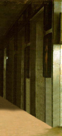
Then, while the first image is only displaced, the second image with the right lateral is displaced and resized. You can not resize CSS sprites or background-images, but you can resize <img> elements by setting the width and height desired.
Un verdadero efecto de parallax no hubiese sido de sólo 4 o 5 capas, sino de una capa por cada pixel de altura del suelo/techo; 200 o 300 capas. El código html/css para ello sería muchísimo mayor, y los browsers actuales no podrían renderizarlo a una velocidad aceptable. Por tanto, tuve que buscar una forma con la que se viese lo suficientemente bien el efecto pero fuese más simple. Lo que hice fue dividir el fondo en dos partes, tal y como se ve en las imágenes superiores.
Mientras la primera imagen sólo se desplaza, la segunda imagen de la pared de la derecha se desplaza y también se redimensiona. No se puede redimensionar los sprites CSS, pero sí que se puede redimensionar los elementos <img> asignándoles el ancho y alto deseado.
Source code / código fuente
Some people asked me for the php script I used to generate the html. I consider it is not very valuable but… here it is.
Varias personas me han pedido que muestre el código en php que usé para generar el html. No creo que sea demasiado interesante pero… aquí lo tenéis.
[…] 3D Meninas explained […]
Hermoso. Supongo que habrás leído este texto: http://www.avizora.com/publicaciones/textos_historicos/michel_foucault/0001_palabras_cosas_cap_1.htm
Salud,
[…] Cómo hacer las meninas en 3D con CSSwww.romancortes.com/blog/3d-meninas-explained/ por asr hace poquitos segundos […]
Maravilloso estudio y trabajo en CSS y HTML
Muchas gracias
saludos cordiales
Realmente has conseguido un efecto asombroso!. Excelente trabajo, muchas gracias por compartir la explicación
Just brilliant!
Román eres un DIOS del CSS!
impresionante, realmente impresionante! esto es lo que significa salir de la caja, mirar más allá de lo evidente…
maestro!
Muchas gracias Roman por su post, me gusto mucho y es muy impressivo. Cuantas horas fue hacerlo?
Michael, muuuuchas horas. Gracias al tiempo que le dedica al CSS y a la explicación me estoy leyendo una trilogía sobre un rey inglés. Y doy gracias que no se le ocurrió hacerlo con el Guernica…
You *can* resize CSS background images, using the background-size property. Of course, this is a part of the CSS3 Background & Borders module, so IE8 doesn’t implement it yet.
I understood how it works by reading the code, but again thanks for “human-readable” explanation. ;]
Menudo trabajo Román! Te quedó un buen resultado :)
Un saludo!
Contestada entonces mi duda sobre los scripts.
Gracias por la parte que me toca :D
Vaya, perdona, no me di cuenta que contestaste en el anterior post, aunque estoy suscrito al feed de los comentarios.
Parece que hay algún problema, por que recibí en el feed los comentarios anteriores al mio, el mio, y del resto sólo los que están entre el de ‘trshugu’ y el de ‘SVG’; ninguno más de momento. Lo que no se ya es si el problema es de google reader o de tu blog.
No me he enterado de nada, pero el resultado es excelente!
[…] Explicación del efecto. […]
extraordinario trabajo has hecho !!!
Ha quedado espectacular !
gracias por mostrarlo !
mar
[…] Hagan clic aquí para ir al blog de Román, donde explica el efecto […]
[…] les dejo el cuadro, y la explicación técnica de cómo lo […]
¡Excelente!
great tutorial! i will definitely use this on my next project…
Fantastic work - great to see code & creativity as a single entity, well done. Keep up the good work.
Beautiful and graceful.
Maravilloso, voy a probarlo. Nunca hubiera piensado que algo asi functiona sin JS.
3D Trends. It ’s cool.
Have you considered connecting this effect to the accelerometer on an iPod Touch or iPhone? I bet you could make it look like a mobile website was a window in to a 3D box if you could assume a starting angle and distance from the viewer’s eyes…
FLIPANTEEEEEEEEE!!!
This is so rad! I’ve been learning some Flash (AS3) and getting stoked on the parallax effect you can do with flash player 10…. this is way better in my opinion. The more I learn about CSS (all versions) and JavaScript and PHP the less I’m interested in learning Flash. But seriously this is great and I can’t get enough of this stuff!
Eres increible! Gracias!
[…] Para saber como é feito, clique aqui. […]
Impresionante, Román insisto, esto debe de documentarse de alguna manera… (GPL preferiblemente para todos), la gente debe de conocer esto.
espectacular, sencillamente asombroso, me gustaria saber tanto como tu….. estoy asombrada
Alabado sea!!!! jajaja debes agregar un RSS a tu pagina para ver las recibir tus ultimas noticias….
Un efecto muy interesante, abre muchas posibilidades gráficas.
Felicidades
¡¡Expectacular!! Me parece que este efecto es excelente y me gustó mucho la explicación, porque es muy sencilla.
[…] diseñador Román Cortés muestra las posibilidades del 3D utilizando sólo hojas de […]
Muy bueno enhorabuena por el post y por el trabajo por supuesto
[…] Caso você queira aprender como faz essa loucura, clique aqui. […]
Excelente trabajo y especialmente el que explicaras como lo hiciste es un valioso aporte a la comunidad de desarrolladores. MUCHAS GRACIAS! Lo que conseguiste es realmente asombroso ya que para solo utilizar CSS el efecto es asombroso, nuevamente gracias por compartirlo.
I love it… pure genius!
Bravo ! Bravíssimo !
De lo mejor que e visto, pocas palabras para describir tu trabajo, y sobremanera te felicito por compartir tan grato trabajo. Congratulaciones para tu persona.